
It's all about the contrast
Let’s clarify: it is not yet another article about color theory. At its core, contrast is way more profound than the relationship between “shadows/highlights” or “warm/cold.” It is a tool that you can use to solve problems and see opportunities in your images. It is really: All about the contrast.
Topics covered:
-
01.
Why Should Contrast be a Priority no 1?
-
02.
Common Knowledge
-
03.
Process of Decision-Making
-
04.
Step 1 - Contrast in Geometry
-
05.
Step 2 - Contrast in Lighting
-
06.
Step 3 - Contrast in Details
-
07.
Bonus Step - Contrast in Movement
-
08.
Contrast - the Measurement of Image Quality I
-
09.
Contrast - the Measurement of Image Quality II
-
10.
Contrast - the Measurement of Image Quality III
-
11.
Conclusion
-
12.
Annotations / Links
Why should contrast be a priority no 1?
Let’s start with a bold claim: “If you understand how contrasts work, you’ll become one of the leading artists in the industry. You will take advantage of it, and it will make your work stand out.” We really believe that’s accurate, and we will make our case for it in this article. But, first of all, let’s quickly describe what understanding of contrasts can lead you to:
What can understanding of contrast do?
Before we all get too excited here, as we already said, we will primarily show you the importance of contrasts in this article. It will be a new way of looking at it. We will show you different types of contrast and encourage you to look for them in any images you stumble upon. From this point on, you’ll be aware that they exist, but taking advantage of them, will take time (a lot of time). It will be an ongoing adventure that involves trial and error, but it will pay off eventually. So, let's dive right into it.
Common Knowledge
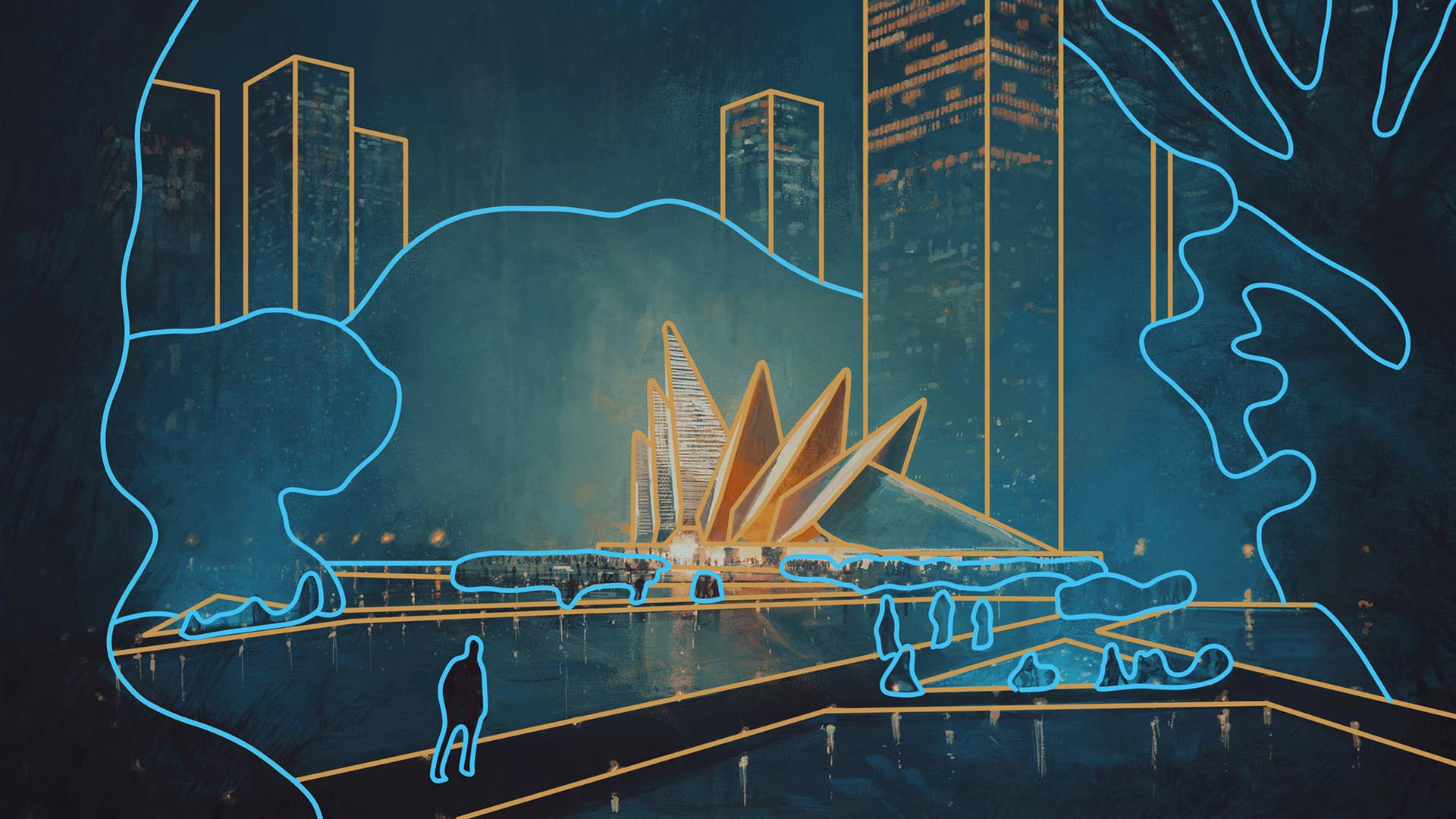
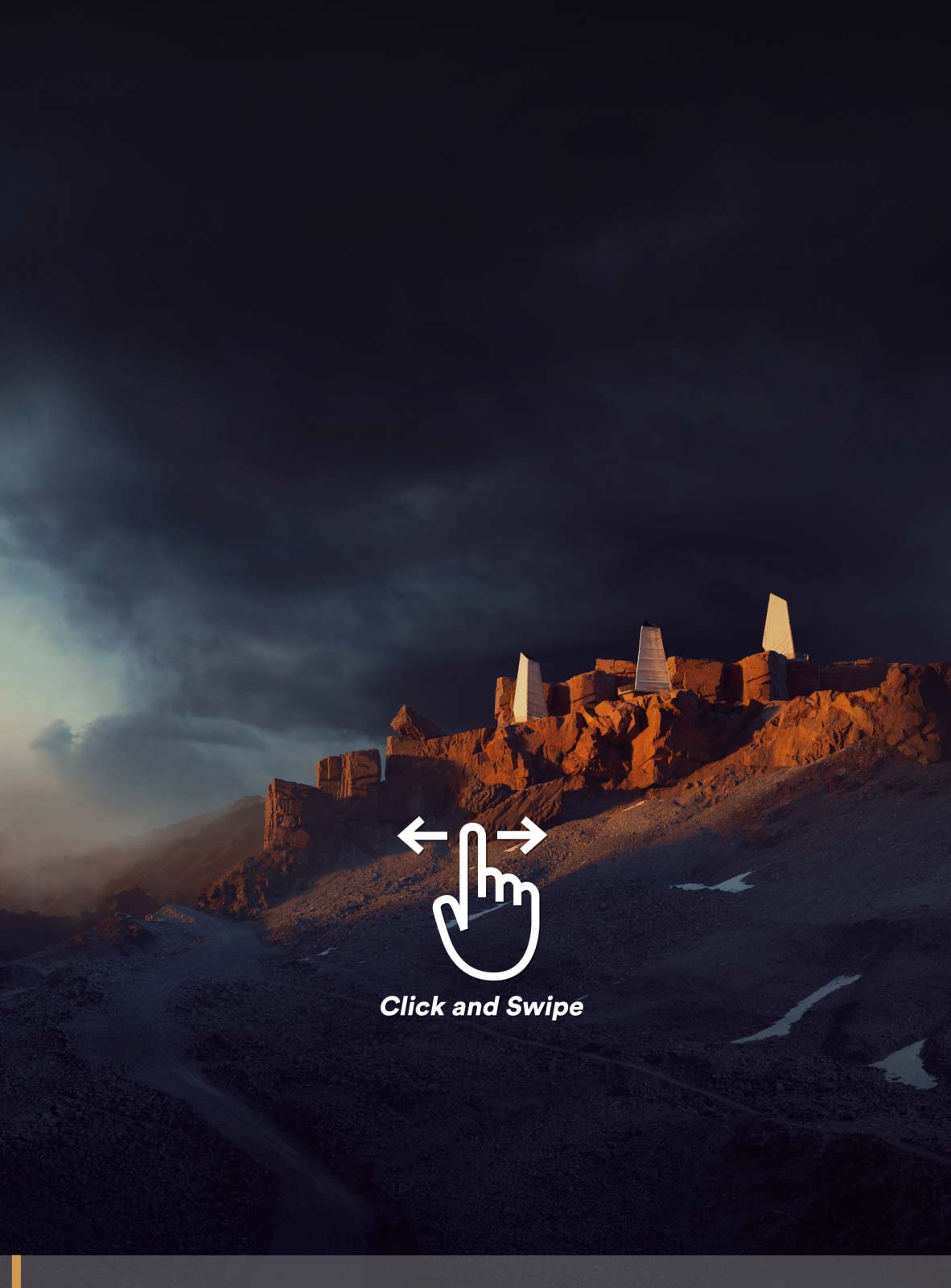
As we already said, contrast is something deeper than the “difference between the colors.” Contrast is everything in art. It is the relationship between any elements in your image. Their difference in color, size, or even if they are moving or not. Everything can be pretty much in contrast to each other, and it seems a lot, but don’t worry. We’ll take it step by step. For now, check the image below, click, and swipe left or right. Just get inspired by the hidden contrasts, even though they might not seem 100% clear at this very moment.

Bartosz Domiczek - Architectural Sketches
It is kind of an overwhelming amount of concepts, especially if you’re a beginner, but it doesn’t mean it’s not manageable. At this very moment, we encourage you to see the bigger picture. Look at the difference between the lighting across the image and the relation between every element in the composition. When you understand how all of it works, you will use shapes, colors, depth, textures, etc., to create striking images. Sometimes, a great image will have several hidden contrasts behind it; sometimes, only one or two. So without further ado, let’s introduce:
Process of Decision-Making
If you want control over your images, you need to break down the work into smaller pieces and look at it from different angles. You need to get different perspectives. Simply because it’s too hard to take everything at once, and it makes your decision process muddled. So, let’s start by analyzing any of your images on three different scopes:
-
01.
Geometry
Is there a big difference between the shape of the objects? Does the size of things give you a sense of scale and depth?
-
02.
Lighting
What is the difference between the darkest and the brightest part? Is the color palette warm and inviting or cold and lonely?
-
03.
Detail
Is there a visible edge between objects in your scene? Are those edges really sharp or somewhat blurry?
Firstly, we analyze our scene’s geometry and ask ourselves many questions about its shape and relationship between objects. Then, we set up a lighting system and add colors. Naturally, we try to make it pleasing to the eye, so there are lovely colors and engaging lighting scenarios. Lastly, we start creating our materials and work on details. So we want to make it more realistic. During that whole process, you will build a contrast between elements, making them attractive, so they work together nicely. Sometimes, you will focus more on a composition (contrast of geometry), and sometimes more critical will be your color palette (contrast of lighting). Seeing the bigger picture will make you grow as an artist. It is also the first step for understanding how to use them. So, let’s break down the first category:
Step 1 - Contrast in Geometry
It is everything that’s in relationship with shape in general, without any information about the color. What kind of forms are you using - sharp triangles or circles? Are those objects human-made, or are they organic? How big they are, how much space there is between them, are they giving a sense of depth, harmony? We build these contrasts to have an exciting form, to draw attention, give a sense of depth and show the relationship between the objects. It is by far one of the most challenging contrasts to understand, especially for beginners, but is arguably one of the most important. We will elaborate on this topic in the future (“Lessons we learn on the composition”), but for now, to make it simple, we divided it into three categories:
-
01.
Shapes
-
02.
Size
-
03.
Spacing and Repetition
Shapes
Try to think about your image as a composition of simple shapes. Just open your image in Photoshop and draw lines around the main objects. You can also use main geometry as leading lines (like in the examples below). This will be the geometric core of your work. Now, you will start noticing different types of contrasts. Are there harsh elements next to round shapes? Are there human-made elements next to nature? By contrasting those elements, you will build an attention point fairly quickly. The examples below are pretty obvious, but even when there are more elements in the scene, you can still break it down and see the main objects in contrast to each other.
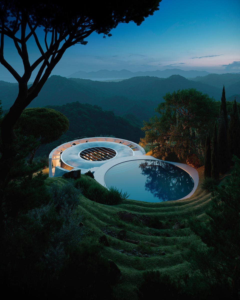
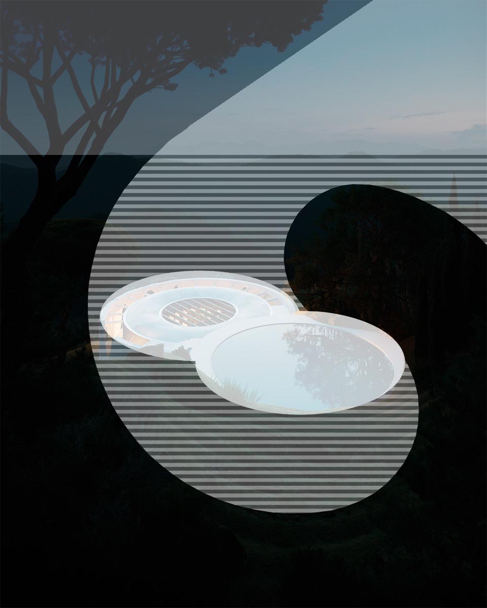
Bartosz Domiczek - Henge Hill
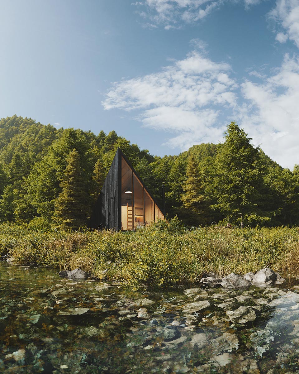
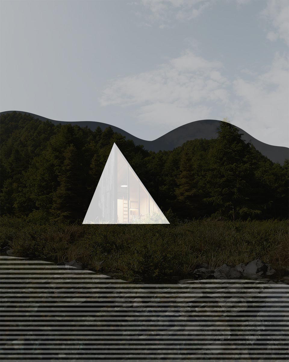
Artur Tamiola - The Cabin
Size
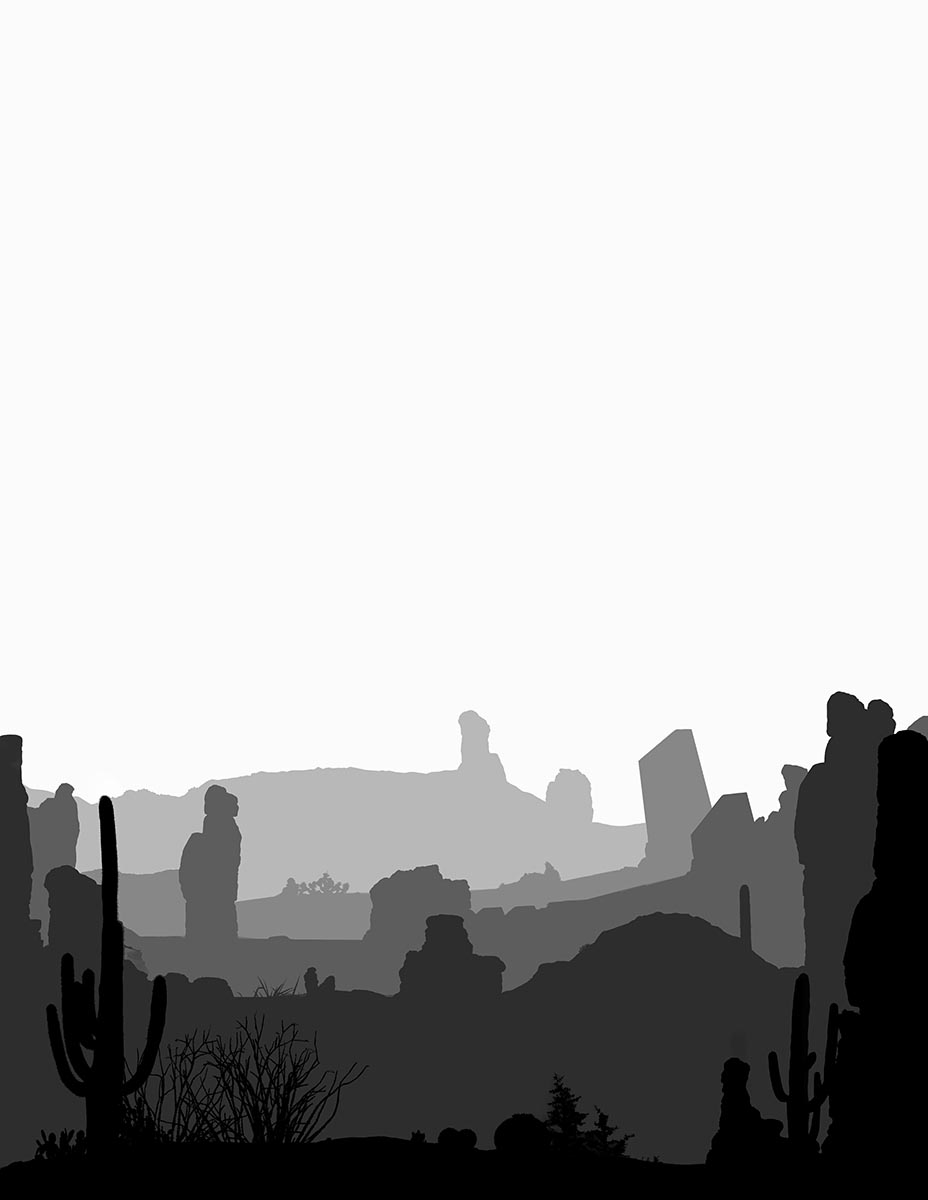
This type is something different than the previous one, even though they directly affect each other. The contrast in size builds the overall feeling of the scale, space, and depth. It will put even more emphasis on the main character. You will also set everything up to scale because a viewer tends to compare everything with familiar objects (a person, tree, etc.). Here, you can always ask yourself simple questions: Isn’t this tree too big? Or the decor too small? Build these contrast to take attention away from somewhere or bring it forward. Also, use the size to your advantage and build a dramatic sense of depth. Just place the same objects far away from each other, like so:
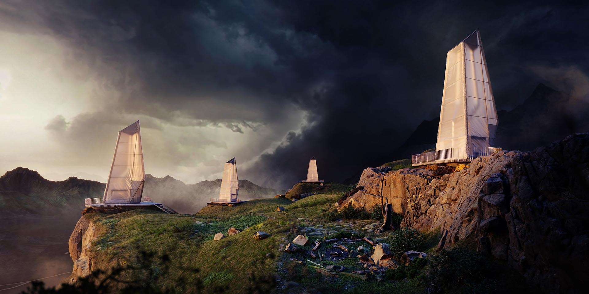
Bartosz Domiczek - Northern Wisps
Spacing and Repetition
This type of contrast has to do with repeating objects as well as the space around them. Let’s bring a row of trees as an example. They will blend with the background if their height and the distance between them are the same. On the other hand, if you need to bring attention to a certain point, you can scale up one of them and give some extra space around it. This way, that particular tree will feel more significant. You can read this visual aspect as if your image was a piece of music. Similar objects close to each other create a rhythm. When those rhythms change, they will draw the listener’s (viewer's) attention.
Bartosz Domiczek - Hoodoo House
Artur Tamiola - Scandinavian Interior
Summary:
All of the contrasts above could be the topic of their own, but we tried not to make it so difficult. If you really want to study them, we collected a couple of useful links at the bottom of the page. For now, try to consciously look at images and just separate the geometry aspect of them. Think about the geometric core and ask yourself simple questions about their relationship. Are they in a dynamic relation, do they bring attention, or are they in a monotonous rhythm? That’s a fantastic exercise to do.
Important Note!
If you’re reading this article for the first time, we recommend pressing “GO TO EXAMPLES” and going to real-life examples straight away. They are fun, and they will quickly give you a different angle on the meaning of “Contrasts.” If you are serious about studying these subjects, we encourage you to come back next time, because it’s a lot to take for one read.
Below, you can find a lot of theory, which is pretty condensed, so as you know, it’s hard to stay focused and take everything at once. We also recommend reading through one step at a time and thinking about it. All of this takes time to digest, so if needed, give yourself a break and take it slowly.
Step 2 - Contrast in Lighting
Now, when we have all of the objects in place, we can start thinking about colors. Meaning the lighting, color palette, and all of the good stuff. So let’s quickly divide them into three categories and explain the main features of each.
-
01.
Value
-
02.
Hue
-
03.
Saturation
Value
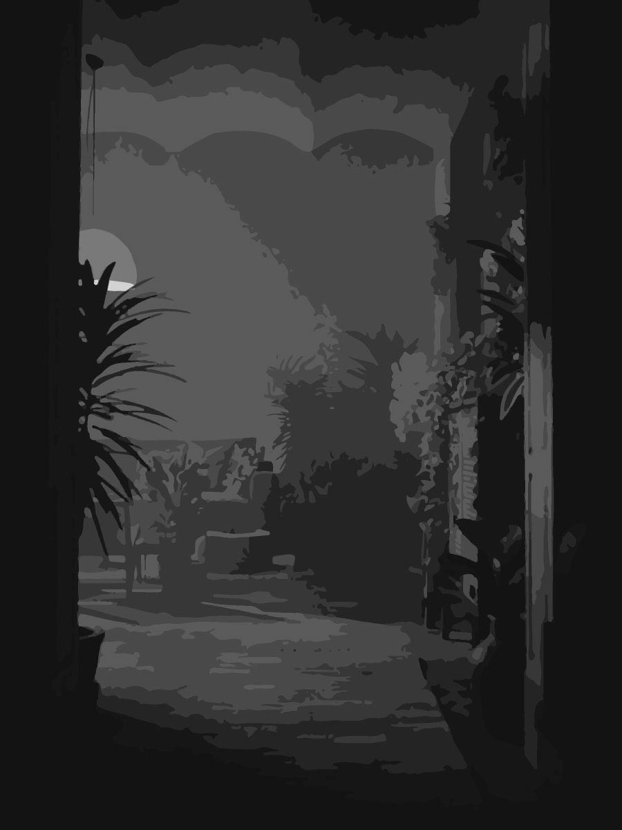
This contrast is closest to the common understanding of the term itself. It is the difference between the darkest shadows and the brightest highlights. Also, how are those values distributed within the frame? This one is pretty easy to read; just desaturate your image. You will notice if there’s a smooth transition from the foreground to the background? Do the main characters contrast with the space around them? Also, as a helpful tip, be careful about the value contrast in your foreground. It is easy to get the strongest contrast in this area, and it is usually not the place where you want it.
Artur Tamiola - Houseplant Delight Red
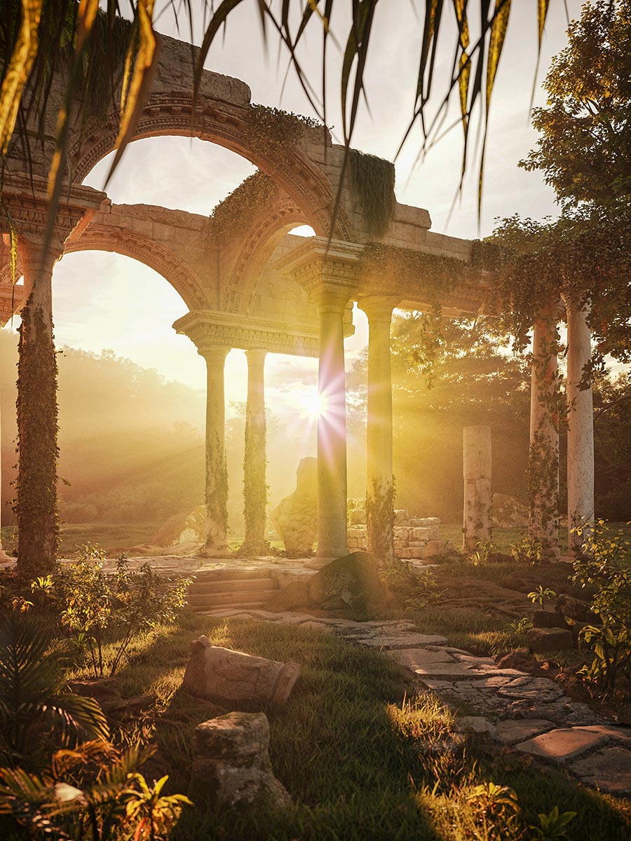
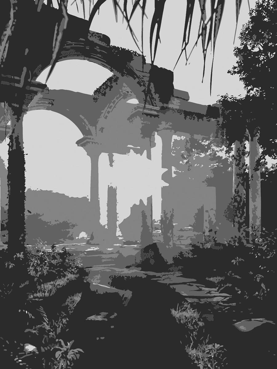
Ewelina Lekka - Mystery Ruins
Hue
This contrast makes the images feel so unique, yet at its core, it is pretty easy to describe; it is simply the difference between the colors on the color wheel. As ArchViz artists, we take hues for granted because they are embedded in the project. Still, there is plenty of opportunities to build better contrasts in hues. Simply by playing with light temperature or slightly bending the color palette. You can ask yourself: Is it warm and welcoming or cold and lonely? What is the color palette in your image? Is it monochromatic or more complex than this? Do you have complementary colors? Speaking of, see how those vivid complementary colors play a significant role in the images below:

Bartosz Domiczek - Nocturnes & Mirages
Bartosz Domiczek - Nocturnes & Mirages
Saturation
This type of contrast is, again, simple to describe but even harder to use. It’s pretty evident that if you put a saturated object in front of a desaturated background, they will contrast to each other. You can still take that simple idea to your advantage, especially when your color palette is monochromatic. Think about an interior consisting of blues, pillows, curtains, mugs, and all. You can change the brightness or slightly vary the hues to achieve a deeper palette. But you can also change the saturation of objects, so it has a more excellent feel to it. The decisions made on the saturation level might help your hue contrast become striking or faint.
Bartosz Domiczek - Scorn of Men
Summary:
Color management is often what makes leading artists shine. With total control of lighting and color palettes, you can create visually striking images. But before you start mixing all of those contrasts, try building your images upon one of them. When you feel comfortable with values, lighting, and all, add color to the mixture. That’s the best way. Just master them one by one. You will get a deep understanding of their relationship and start being playful with color.
Step 3 - Contrast in Details
At this point, we introduced the contrasts in geometry and lighting. We pretty much have everything that consists of an image. But still, we can go a little deeper. Details can put the image forward or, unfortunately, destroy it. Like any other contrast so far, they make the attention point clear, but most importantly, they can also explain the fabric of objects. Let’s split this category in two, quickly wrap it up and see some in-depth examples.
-
01.
Texture
-
02.
Edge
Texture
This type of contrast can be used in smaller parts of an image, especially on flat surfaces. All surfaces have some texture to them. For starters, think about a wall, and in our minds, let’s apply a plaster material to it. It looks artificial when it’s barely visible, and when you show it too much, it looks dirty. So you need to use this contrast to your advantage. Try to use it wisely, so your images have a better photorealistic feel to them. Also, be aware that these decisions will have a massive impact on your images’ overall look. Look at the examples below, how artificial they feel without textures (even though they have beautiful contrast in values and hues).
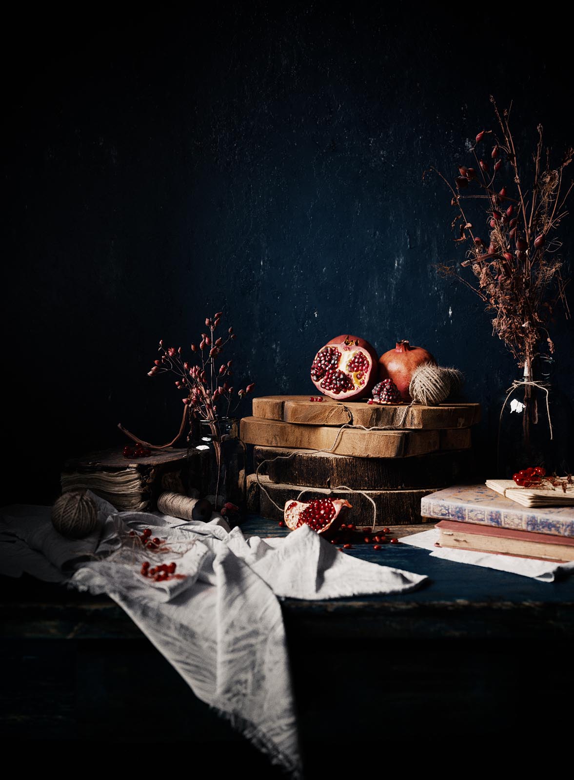
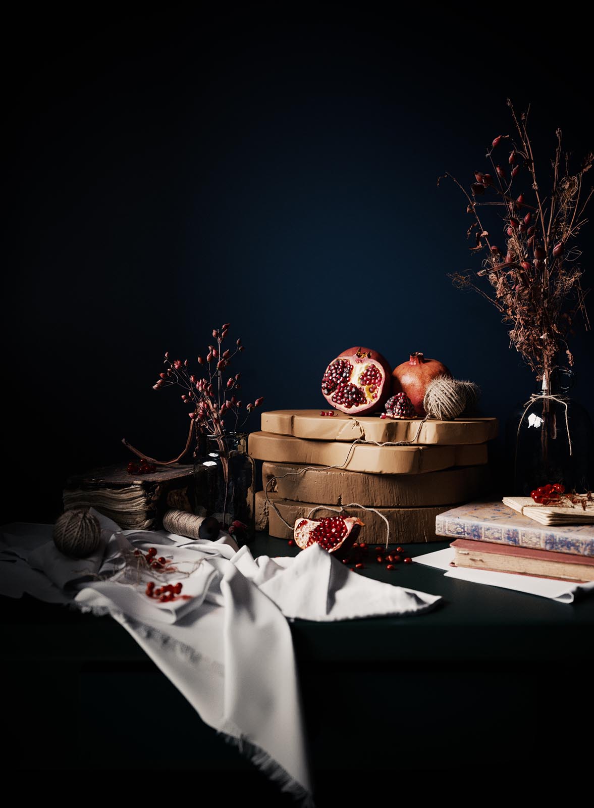
Ewelina Lekka - Still Life Celebrating
Ewelina Lekka - Still Life Celebrating
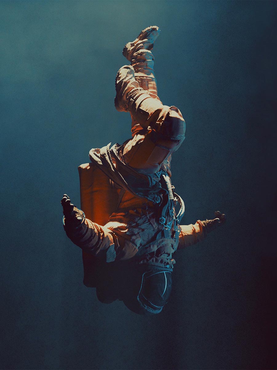
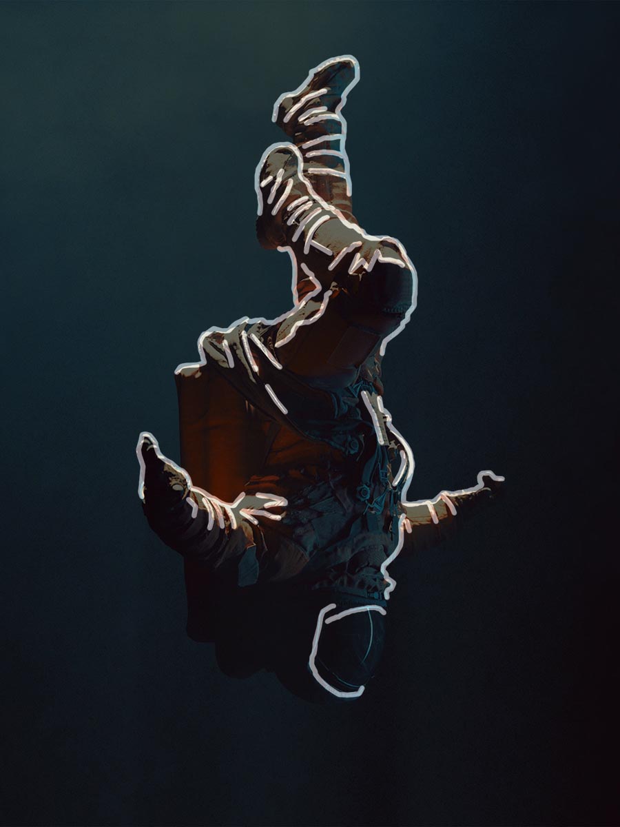
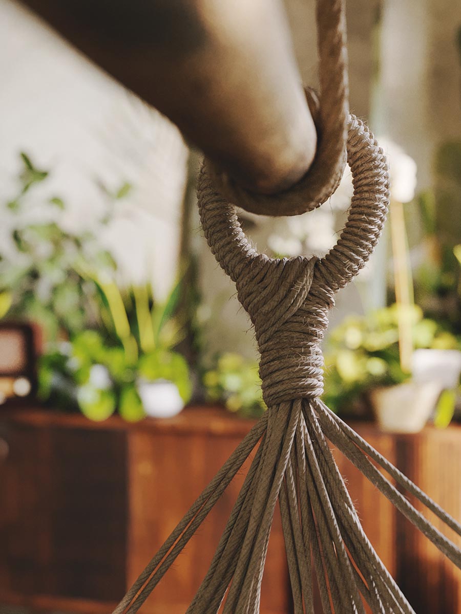
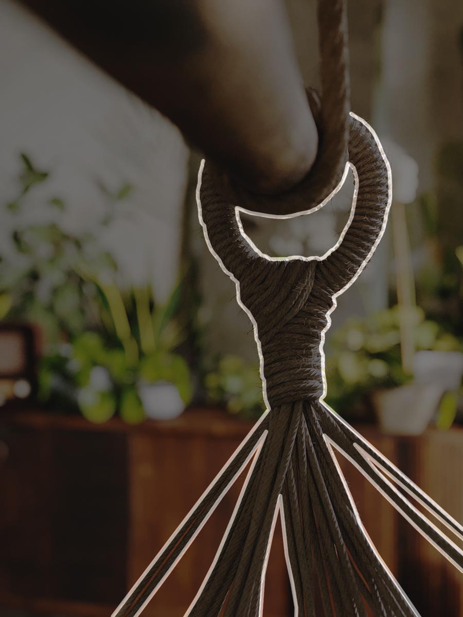
Edge
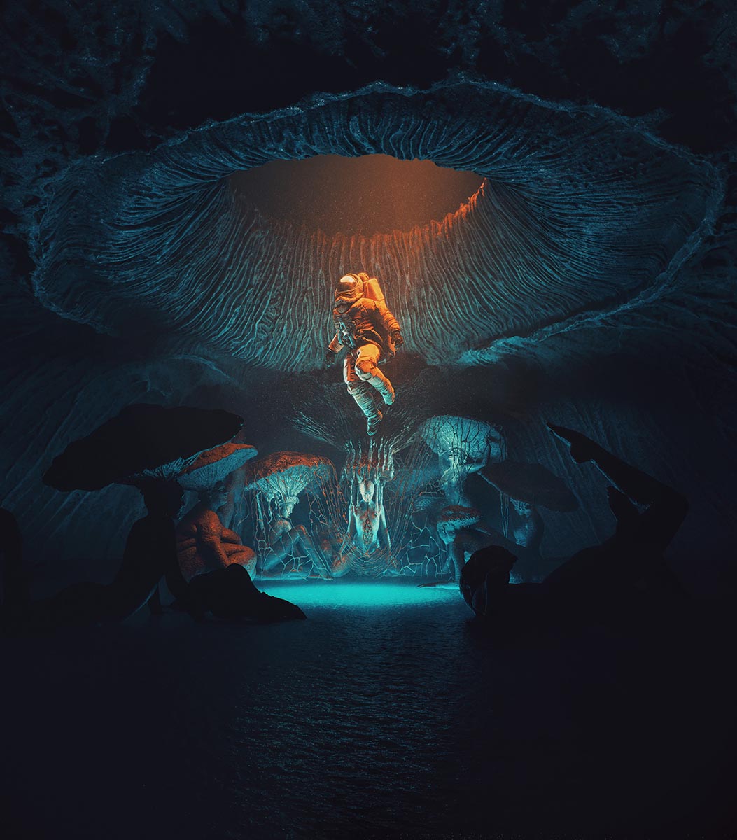
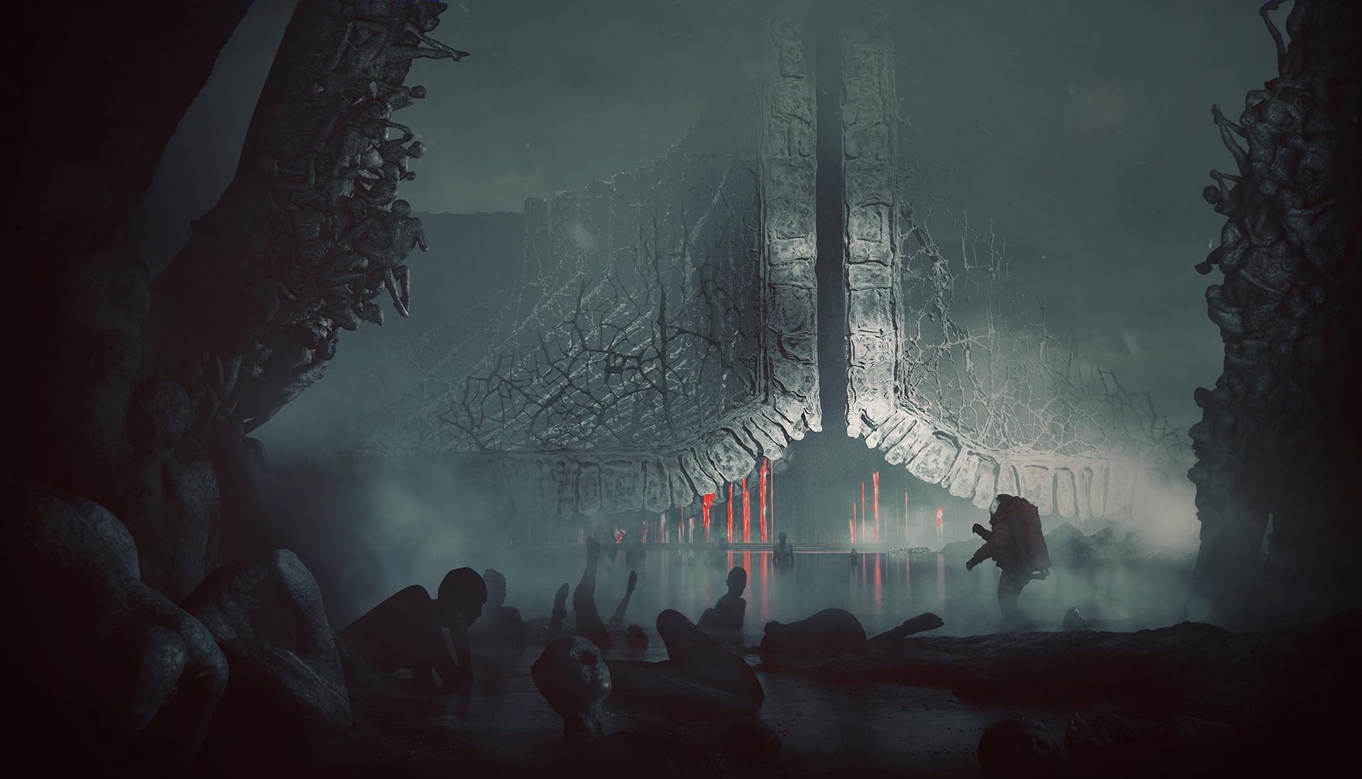
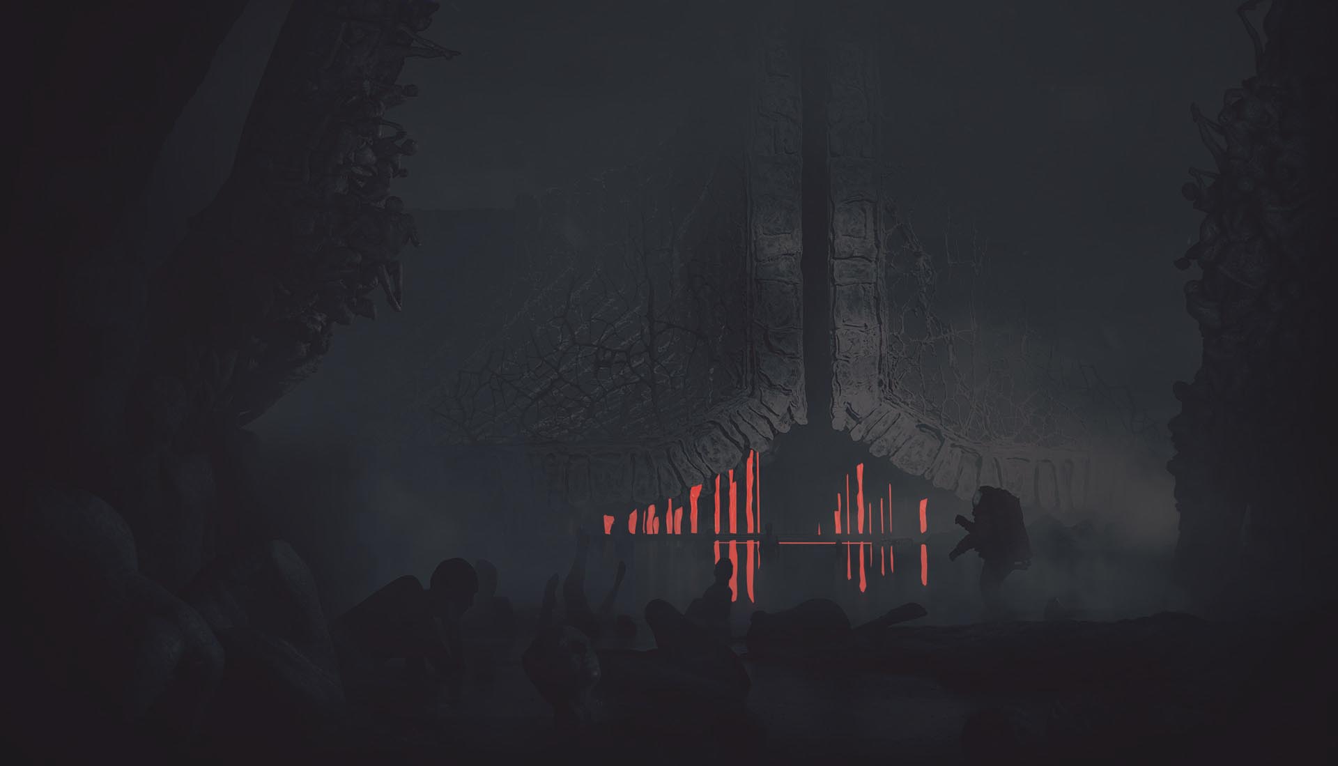
It is pretty easy to explain edge contrast when we use a substantial depth of field. When we have a shallow depth of field, we immediately notice the attention point. All of the blurry objects contrast to the ones that stay in focus (Example 2). We can go deeper and analyze it without DOF. When you look at the first image (Example 1), it’s easy to notice that the astronaut is coming forward. There’s a visible edge contrast, even though there is no Depth of Field Effect. When you think more about this example, you start noticing a great use of contrast in values and color. Also, there’s more detail frequency in the astronaut itself as opposed to the background. All of that creates an effect of well-defined edges that are in contrast to the background.
Bartosz Domiczek - Scorn of Men
Artur Tamiola - Houseplant Delight
Bonus Step - Contrast in Movement
Movement
Okay, this is honestly the last one we will introduce. Examples are coming up soon! Nevertheless, it is the one that is important to understand because this type can easily introduce emotions to our image, storytelling if you will. Something that is in motion stays in contrast to the static surrounding, simple. This way, we can build a dynamic feeling really fast. You can add cars in motion blur that give you a sense of speed, or animate trees, so they have blurry leaves. This way, you will further put the attention point on what’s necessary, like so:
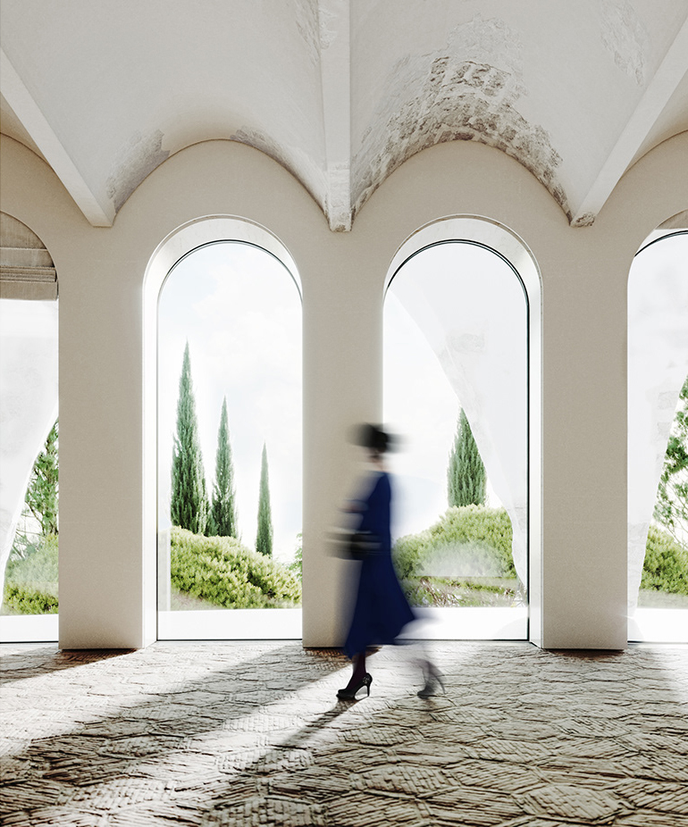
Bartosz Domiczek - Henge Hill
Artur Tamiola - The Cabin
Fun fact! Have you ever noticed why people used such blurry characters in architectural photography? You can explain it using the contrast of movement. If there were no motion blur, the character would come forward and start playing the first role. But we want to have architecture as our hero. So we need to make it so much more blurred than in reality because it needs to stay in contrast in movement. We can also add that this character builds a contrast of size, as it is giving a sense of proportion; see how you can start noticing them right away?
Contrast - the Measurement of Image Quality I
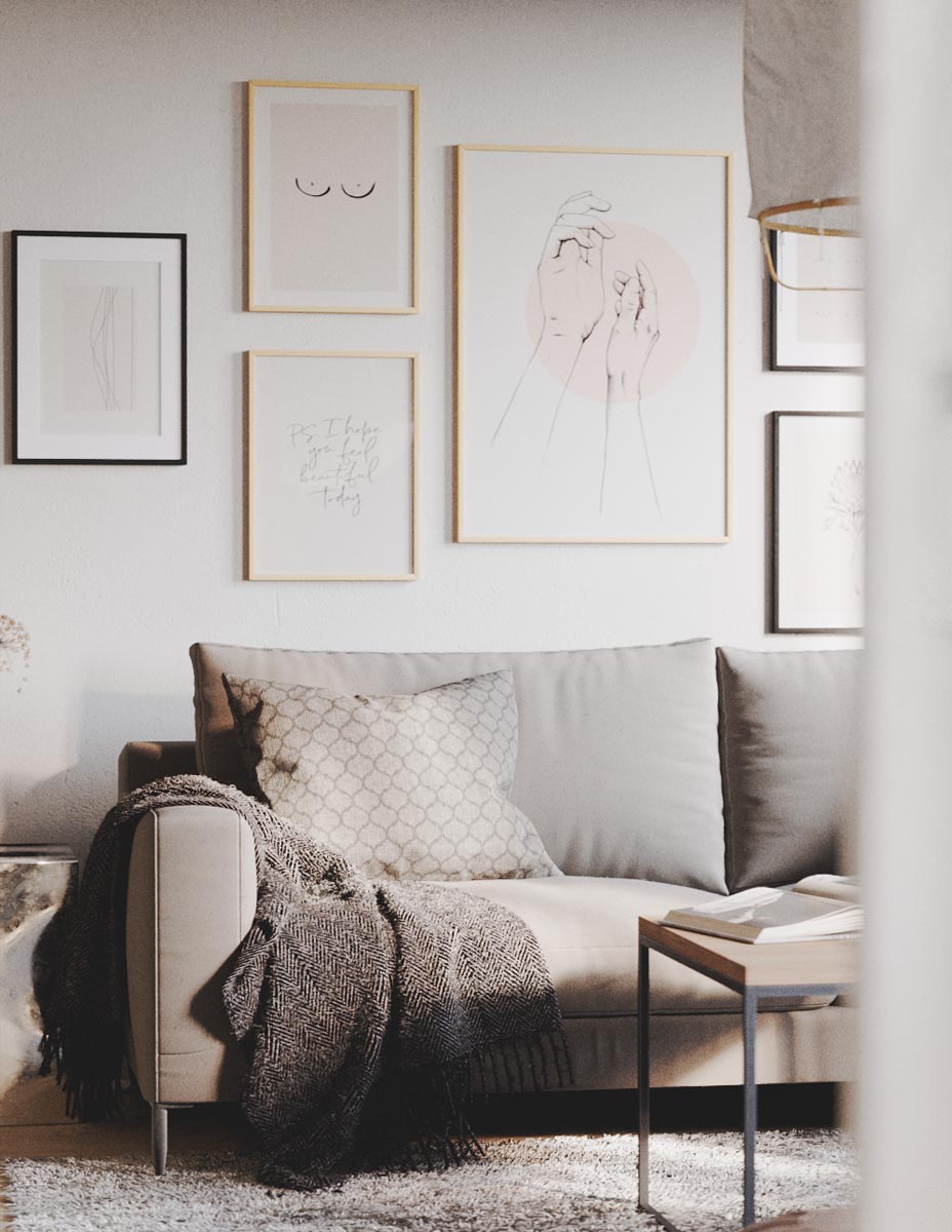
Phew, that was a lot. But hopefully, you’re still with us. Now, remember when we said that understanding contrasts would make you a leading artist in the industry? Well yeah, looking at the scope of contrasts we have in mind, it’s pretty much everything that makes an image. It can be a measurement of image quality. So, try to see the bigger picture in any image you stumble upon, break it down and read the hidden contrasts. As an exercise, let’s check an image from Scandinavian Interior by Artur Tamiola. Try to visualize any hidden contrasts before you check them out, especially the image’s geometric core.
Artur Tamiola - Scandinavian Interior
When we closely analyze the image above, we can see that objects in the scene mostly form straight lines (ceiling lines, rectangular frames). The geometric core is pretty simple, yet there is one hidden contrast in geometry. Even though the frames have the same shape, they have different dimensions, so they contrast in size. What do you think about the contrast of lighting, though? We can easily read the image’s depth simply because we have a bright door next to a dark vestibule. Furthermore, we can notice a split between the warm and cool tones on the image’s right side (presumably close to a window). All of that gives us a clear understanding of the space. We “feel” how long and wide the room is because of the contrasts in lighting.
Artur: For the most part, I have struggled to understand why some images are better than others. I mean, I saw the difference, but I couldn’t explain it. Using different types of contrasts as a reference point helps me understand what I did well and/or poorly. I can just break down any image I like and see if there are any opportunities missed. Also, such a fun exercise to do! :)
Contrast - the Measurement of Image Quality II
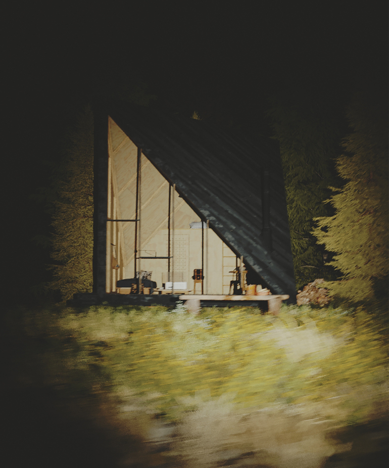
Let’s check another example from the great Polish CG artist Ewelina Lekka. One more time, try to visualize any hidden contrasts beforehand. Try to break the image down as much as you possibly can. What kind of exciting contrasts do you find? Try to visualize any hidden contrasts before you check them out.
Ewelina Lekka - Dream Garden Shed
It’s a beautiful piece, and now we can experience it a little bit deeper. What strikes us immediately is the contrast of lighting. It gives us a sense of depth and puts our attention point on the cabin. But obviously, there’s more to it. We can read that there’s hidden movement in the scene. Water and vegetation are active to the contrast of the static, peaceful bed. There’s a contrast of the human-made structure with the organic surrounding. Also, there’s a slight contrast with the warm and cool tones. Pretty cool, huh? Let’s try again!
Ewelina: I was amazed at how many ways we could describe this contrast. It definitely changed my point of view on creating images. Many thanks to Bartosz and Artur for using my works as an example. I was surprised how many hidden contrasts they have in their images! :)
Contrast - the Measurement of Image Quality III
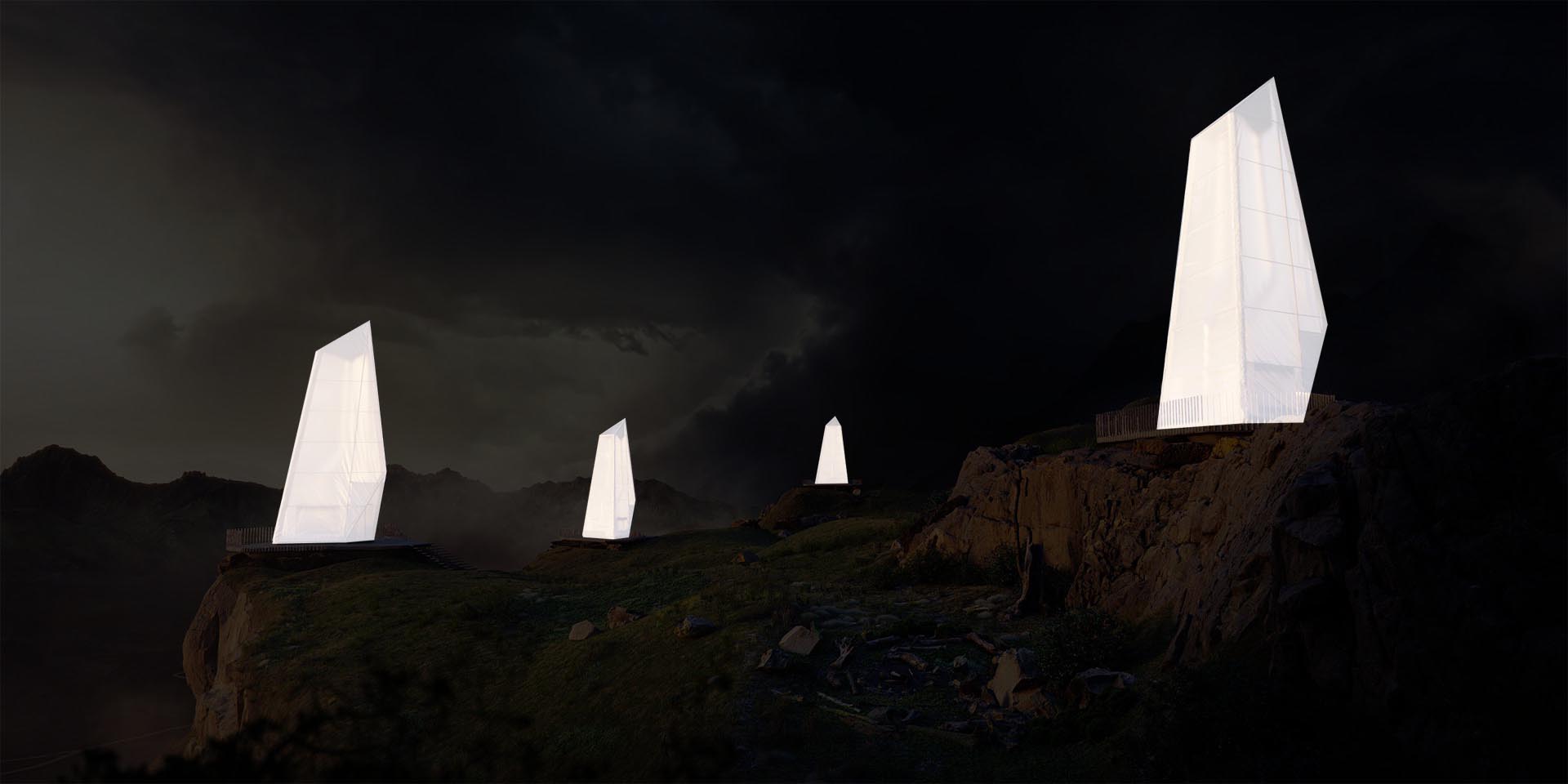
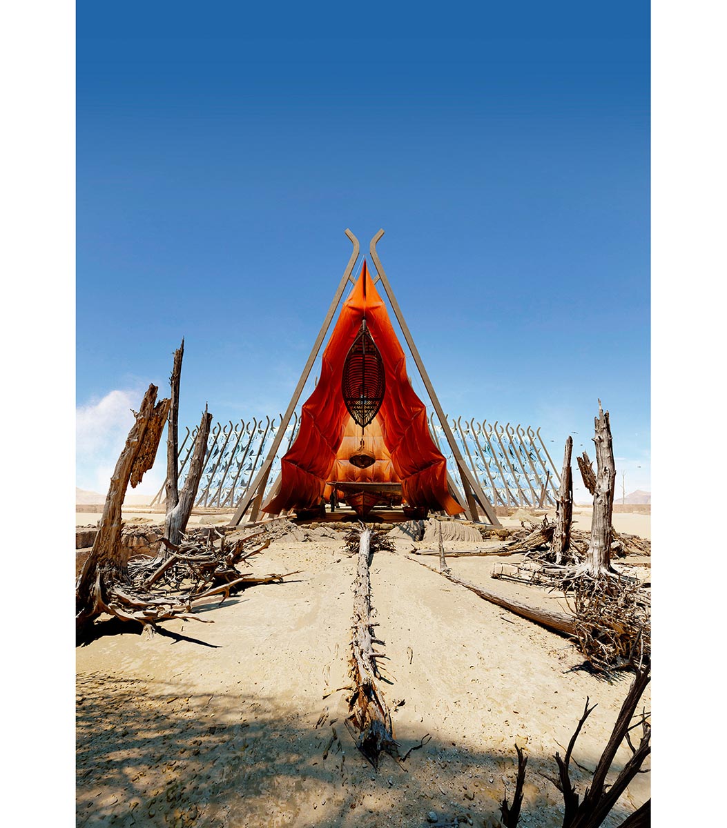
Our last example comes from Bartosz Domiczek and his world-renowned project called “Northern Wisps.” Yet again, try to think about the hidden messages, contrasts of geometry, lighting, and detail. What is the importance of the lighting and color palette? Do you find any repeating shapes? How about the detail frequency- Does it lead you to a certain point?
Bartosz Domiczek - Northern Wisps
How did it go? Well, let’s break it down anyway. We can see that the image is built upon a very pleasing color palette. Colors complement each other, so they contrast in hues. Also, we can clearly understand the attention focus because of the light’s direction (value contrast). What’s interesting about this one is that there’s hidden movement. Wisps are the blissful getaway from the dramatic clouds. They stand in contrast to each other.
Bartek: There are a lot of „natural” or „instinctive” elements in an artist's life but it's great to eventually quantify some of those vague impressions. And deconstruction of the contrasting elements is just one great method to analyze, compare and build images. Certainly, you need to have some additional knowledge about composition or color correction to fully utilize it but we will get there pretty soon in the next articles.
Conclusion
Contrasts make our images powerful. It is what makes pretty much everything interesting. As humans, we interact with things that stand out, and we notice the change in our surroundings. If we start seeing them consciously, they are pretty much everywhere. So from this point on, take advantage of them, and don’t miss any opportunity to make even more powerful images. Simply by using contrast- sometimes adding them to the mix, sometimes removing. Because really, it is all about the contrast.
Enjoyed this article?
Check CommonPoint MasterclassAnnotations / Links
Special Thanks to Ewelina Lekka for supporting us!
Ewelina Lekka is the founder of EL DESIGN Ewelina Lekka Visualizations, an architect by trade, and a self-taught 3D CG artist. Ewelina specializes in exterior and interior visualizations, but her main focus is providing top-notch architectural visualizations with high-quality greenery and a rich environment. She also develops her craft with various personal projects, which is the best way to constantly take up new challenges and stay creative all the time.
List of useful links:
The Principles Of Design IThe Principles Of Design II
Contrast in Art – What It Is and How to Use It
What Are The Principles Of Art (Or The Principles Of Design)?
Visual Elements – The Building Blocks Of Your Painting
10 Top Photography Composition Rules 20 Composition Techniques That Will Improve Your Photos
Contrast And Human Perception In Design Micro Contrast and the ZEISS ‘Pop’ – by Lloyd Chambers
What is Micro Contrast?
Stay Tuned!
Enjoy the upcoming free content, all of the updates on our work and other cool stuff we’re preparing for you.
Leave us your email and always be the first to get noticed.