
Yes! To Fresh 3d Greenery
Having plants all around us inspires our curiosity and creativity. As an artist, we endlessly experiment with greenery, just trying to get that perfect material. So today, let’s come one step closer to understanding the importance and techniques behind fresh greenery.

Topics covered:
-
01.
Why is Greenery so important?
-
02.
Expectations vs. Reality
-
03.
General Workflow
-
04.
Step 1 - Investigating the 3d geometry
-
05.
Step 2 - Understanding translucency
-
06.
Step 3 - Establishing the colors
-
07.
Step 4 - Adjusting reflection
-
08.
Step 5 - Fine-Tuning and iteration process
-
09.
Common Mistakes
-
10.
Examples
-
11.
How do plants get their color?
-
12.
Conclusion
-
13.
Annotations / Links
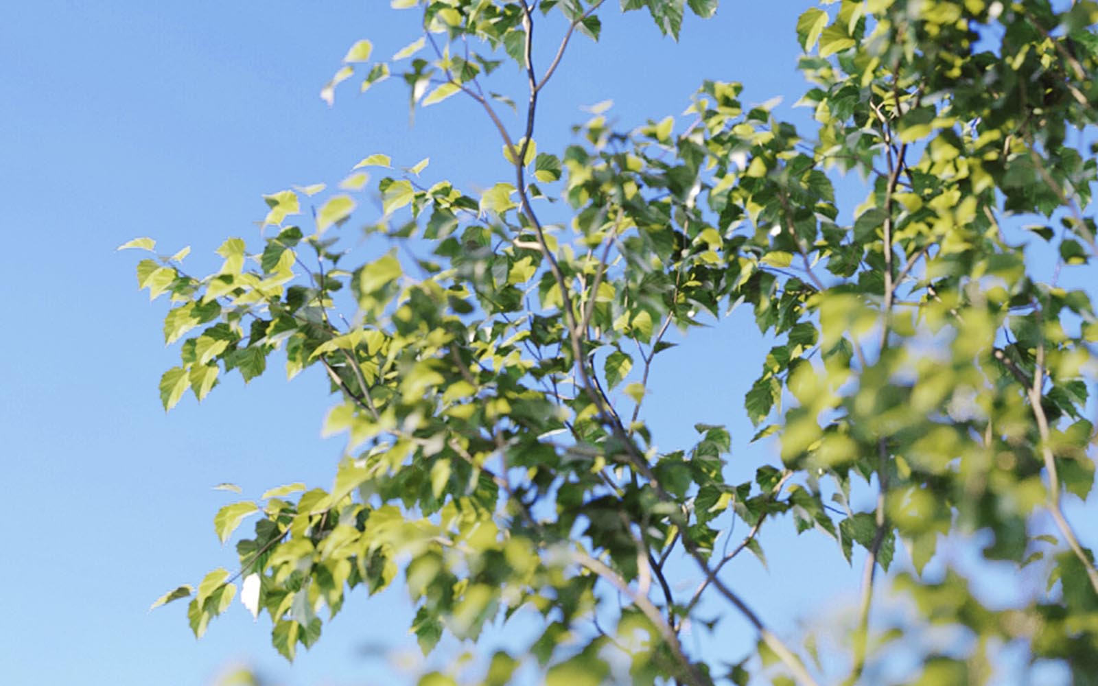
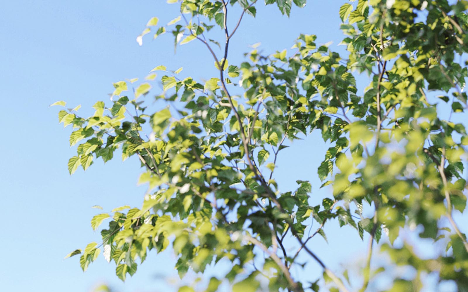
Why is greenery so important?
Fresh and zesty yellow shades of green remind us of the first days of spring. Just the memory of flourishing foliage motivates us to take a deep breath. It’s the visual stimulation, the natural aesthetics that are so soothing to people. Along with that, obviously, come all of the well-being and health benefits. Needless to say, we have a strong relationship with greenery. As an artist, we should take it profoundly because it is a relationship in beauty as well.

Artur Tamiola - Houseplant Delight

CommonPoint - Spa
Using greenery in any shape or form is a powerful tool that we need to use wisely. Having plants in interiors will help you achieve a more optimistic outlook, increasing perceived happiness. While using greenery in exteriors beautifies the local environment and raises the appeal of the subject. Lovely greens areas just make for good living environments. We need to understand how to use it because failing to do so will disturb our audience immediately. So first of all, let’s ask ourselves - What type of green do people expect?
Expectations vs. Reality
All of us have preferences when it comes to color; that’s obvious. But for certain ones, we even have expectations. Studies repeatedly show a pronounced preference for some colors, and green shades of foliage are one of them (along with sky and skin). What’s interesting about those studies is that we tend to remember those colors more vividly than they are in real life. We expect them to be more intense, more saturated, if you will. We always remember the grass to be greener than it actually is. That’s why we tend to apply more saturation to it, as our audience perceives it.

Color Moodboard

Color Scopes
Davinci Resolve - Vectorscope / Parade (Y)
What about the hues? Unfortunately, it’s impossible to pinpoint any exact color because people have a wide latitude of preferred ones. In reality, green foliage can range from yellow-greens to very blue-greens, and there’s a good reason for that (explained in the last chapter). Also, it’s pretty interesting that people perceive darker green leaves as healthier. That’s because lighter ones tend to go neon very quickly, which feels somewhat artificial. For now, we need to realize that our clients will be susceptible to foliage color. Therefore, we need to have total control over it. So let’s get right to it!
General Workflow
The approach we’re going to take is straightforward and quite effective. We will explain our process step by step and show the reasoning behind it. It doesn’t mean it's perfect or will work in every possible scenario. It certainly gives one perspective on creating plant shaders, and it’s a great way to experiment with them if you haven’t already. You can also find ready-to-use shaders in the “Examples” section, which should be a good starting point for further exploration. So here we go: there are five basic steps that we’re going to follow:
First, we will look into the 3d model geometry and discuss its potential behavior with lighting. Then we will explain how to approach translucency and set some general guidelines for foliage color (hues and brightness). Next, with clever use of reflection, we will add some attractive characteristics. Eventually, we will fine-tune our materials and go through every step once again. It seems intuitive, and it really is, but it takes practice to master. So if you haven’t yet created any plant shaders from scratch, let’s make the first one together!
Step 1Investigating the 3d geometry
For starters, we need to be aware of one simple thing. Your shading process begins in the viewport. We need to understand what kind of geometry we are dealing with because it will interact with the lighting later on. Very rich and bushy willow will create deep shadows, while a single leaf will produce almost no shadows at all. Different objects will have other properties, so the same materials don’t apply to every kind of geometry. For example, the same grass material won’t work on every possible object simply because the grass clumps are more or less dense.
Remember: you can always modify your 3d geometry. You can add some leaves to a house plant or decimate a clump of grass if needed. This little script (available here) randomly selects elements in an object, so it might come in handy when you want to delete some geometry.
Let’s start the material creation process and bear in mind that it works for 3d geometry with no thickness (no shell modifiers allowed). The first thing that we will be focusing on is the surface, which is never 100% smooth in reality. We want to add some intricacy to it, and it will be essential when dealing with closeups. We can achieve that with the simple use of a bump or displacement map.
Displacement
Trees from Evermotion 15th Anniversary Collection ( download here )
Step 2Understanding translucency
Most of the greenery objects are so thin they can be considered translucent. That’s noticeable, especially when you look through a leaf at the sun. Colors turn brighter, more saturated, and vivid. It is caused by light passing through a leaf. The more light passes through, the more colorful it gets, so we say it is more translucent. Keeping that in mind, let’s do a little test and focus on translucency only. How does it look on a full scale from 0 to 100%? Can you pinpoint a specific number (or a range) when it becomes more natural?
Translucency Fraction: 0.0 - 1.0
Trees from Evermotion 15th Anniversary Collection ( download here )
We can immediately see that extreme values (like 0.0 or 1.0) look artificial, but somewhere around 0.5 - 0.6, it gets more natural. It’s hard to pinpoint a specific number at this stage, and it is okay because we don’t need to. We will make a calculated guess for now, and we will refine those numbers later on. As a rule of thumb, thicker objects will be less translucent, so for example, you can expect monstera leaf to be between 0.05 - 0.4. Thinner things like lawn grass will be more translucent (between 0.3 - 0.7). Every object will have different values to make it work, and with experience, you will guesstimate it better.
Step 3Establishing the colors
At this point, we need to find a pair of colors (or textures). The first of them will be our base color, and the second one will be forced when light passes through, and the material turns more translucent. Our result will be a combination of those two textures, depending on the translucency amount, or in other words, how much light passes through. Now, it’s tricky to find those pairs right away, but we need to start somewhere. So to give you some general idea, we created four different combinations to showcase the most important features:

-
01.
Reference Colors
Colors that we used in the final shader -
02.
More Saturation
Saturation changed from -0.2 to 0.2 -
03.
Shifted Hue
Hue changed from -5.0 to 8.0 -
04.
Brighter Colors
Gamma changed from 0.5 to 0.7
We will use those four cases and check how they behave in our rendering. You can see what pairs we are using in the right bottom corner and their effect on the rendering overall.

Various Base/Translucency Pairs
Trees from Evermotion 15th Anniversary Collection ( download here )
Even when we use slightly different textures for our shader, they still significantly impact the final rendering. Some cases rarely will work - having base color too bright won’t produce deep shadows. Having strong saturation and an incorrect hue will give an artificial look as well. So what are the perfect values? Unfortunately, there’s no go-to answer, but we will provide you with a framework to work with in the last step. Still, if you haven’t done any plant shaders yet, you can just set the base color dark/less saturated and the other brighter/more vivid, and we are good to go for now.
Step 4Adjusting reflections
At this stage, we have our starting point, which will get more precise over time. But still, there’s one thing to discuss before fine-tuning the final shader. We focused on the light passing through, but we can adjust the light reflected as well. This step will bring the perception of surface properties. We will ‘feel’ the weight and textures with clever use of reflection. So we basically add attractive characteristics to it. Let’s check how does our leaf behave in different reflection conditions:

Reflection IOR: 1.0 - 3.0
Trees from Evermotion 15th Anniversary Collection ( download here )

Reflection glossiness: 0.0 - 1.0
Trees from Evermotion 15th Anniversary Collection ( download here )
As you can imagine, this is another process of finding that sweet spot. It’s worth mentioning that higher IOR values will give the appearance of metal. Anyway, usually, vegetation IOR value ranges between 1.2 – 2.0, but you can narrow it down to 1.3 – 1.5 to easily get acceptable results. Also, adjusting the glossiness will get you from a very dry to a very wet appearance. The proper values depend on the plant itself (whether it is matte or waxy), and additional deviation will be automatically read as wilting (if the glossiness is lowered) or being covered with water (if it is boosted). Now, the cream-de-la-cream of shading process:
Step 5Fine-Tuning and iteration process
This step is self-explanatory, yet arguably, it is the most important one. You will go back and forth and tweak everything, and this is where studying references and practice pays up. Start the interactive rendering, see how your plants behave from various angles. You will change the translucency level, rotate the object, see the difference, and the same goes for every other value. There will be minor adjustments, which can potentially have a significant impact on the outcome. Just remember, you already have all the settings you need to make it work.
Still, to get you going, we prepared a list of the things we learned along the way. And we hope it will give you a framework to keep in.
-
01.
Study references, study references, study references and immediately put them to practice
-
02.
Start with guesstimating how transparent your object is (is it thin or thick?)
-
03.
Set the base texture rather dark and desaturated, and focus on tweaking translucency level/texture
-
04.
Be aware of hues selection; this will most notably affect the perceptions and expectations of color
-
05.
Watch out for saturation, your textures could look “fresh” in the material editor, but they can provide artificial results eventually
-
06.
Always investigate the appearance of your shaders in various angles and lighting conditions
-
07.
Bump, and reflection settings provide the extra “bite,” but the shader should mostly look fine without them
-
08.
Your shaders should mostly work in every lighting scenario (there’s something wrong if they don’t)
-
09.
Turn off the reflection and bump, if you struggle with the overall appearance
-
10.
Don’t be afraid of experimenting, don’t give up, and have fun!
We also prepared even more tips to add to that list, looking at it from the other angle.
Common Mistakes
In the list below, we tried to pinpoint when you’ve gone overboard one way or another. It will help you stay focused and keep fine-tuning even smarter:
-
01.
Artificial Shadows
Too much normal bump or displacement -
02.
Artificial color
Too much blue/yellow in a base color -
03.
Neon appearance
Too much saturation/brightness in a base color -
04.
Candy appearance
Too much translucency -
05.
Metal appearance
Too much reflection IOR -
06.
Rubber appearance
Too low reflection glossiness
That’s it; let’s check a leaf shader that we’re using in our upcoming project.
Examples
You can find ready-to-use leaf shaders down below. By any means, they are not perfect, nor will they work in every possible case. Still, we prepared two different lighting scenarios to showcase its properties while using two separate HDRIs. We encourage you to use these materials merely as a reference point, experiment further and have fun. Also, if you would like to share your experiences/struggles/tips about making plant shaders, we’d love to hear from you (hello@thecommonpoint.com).

Leaf Shader
Trees from Evermotion 15th Anniversary Collection ( download here )

CommonPoint - Spa

Leaf Shader
3dsmax / Corona Renderer
So that’s pretty much it, or oh wait! We owe you an “explanation.”
How do plants get their color?
The short answer is: “chlorophyll,” but hold on for a second; let’s break it down step by step. First of all, chlorophyll is a green pigment found in plants. Plants use chlorophyll and light to make food. Now, it gets interesting because chlorophyll is one little picky guy. When a full spectrum of white light reaches a plant, it absorbs mainly the red and blue wavelengths. The reflected fraction ranges from yellow-green to blue-green light. These are the wavelengths, which eventually reach retinas in our eyes, where the perception of the color is formed. So when you see a full-grown healthy leaf, there will be no red or orange color in it. But they will start to appear in autumn when they begin to die and absorb less of those wavelengths. Quite interesting, isn’t it?
Conclusion
Being surrounded by plants affects our lives tremendously; we fall for the appeal of its universal beauty. We also share a common understanding of its color, so they need to be as authentic as possible. Perfectly executed foliage materials will instantly bring positive emotions and raise your work’s value. Studying fresh greenery should be very high on your priority list. If you haven’t already, start doing plant materials today. If you do, try to find different ways to push yourself. Analyze the greenery around you, hues, and brightness. How much light does it reflect and refract? Everything is within your reach to Become a Better 3d Artist.
Artur: Having fresh foliage is a cheap way to add huge production value to your renderings. Just play around with it, experiment little by little, and eventually, shading plants will naturally ‘grow’ into your workflow.
Bartek: Balancing the colors of the sky and vegetation is often a make-it-or-break-it question in architectural visualizations. We will certainly come back to this issue in the future "How to Perceive Sky's Color?" article. Hopefully, you’ll stay with us for more yet to come.
Enjoyed this article?
Check CommonPoint MasterclassAnnotations / Links
Stay Tuned!
Enjoy the upcoming free content, all of the updates on our work and other cool stuff we’re preparing for you.
Leave us your email and always be the first to get noticed.