
Day to Night Transition in No-Time
The world looks different at night. Otherwise mundane things can become spectacular, dramatic, or even scary. Now, what if you use all of that nighttime magic in your renderings? Let’s explore it together!

Topics covered:
-
01.
Common Knowledge
-
02.
Colors of the Night (Expectations)
-
03.
Building Visual Interest
-
04.
Part 1/4 - Base Lighting
-
05.
Part 2/4 - Interior Lighting
-
06.
Part 3/4 - Architectural Lighting
-
07.
Part 4/4 - Landscape Lighting
-
08.
Examples
-
09.
Colors of the Night (Artistic)
-
10.
Why the night seems below 3500K?
-
11.
Conclusion
-
12.
Annotations / Links
Common Knowledge
During the daytime, we experience the sunlight, and during the night, we don’t. Simple as that - just a difference in illumination. But not really. You can get exceptional results by setting up the hdri map as a daytime illumination system, but unfortunately, the same rarely applies to nighttime rendering. In fact, if you ever tried only to use hdri for that, you might feel quickly discouraged because it’s just not enough. To tell you the truth, it’s the first step to pull it off, but we will get into that soon. First of all, let’s discuss what’s the fundamental differences between night and day:
-
Exposure Levels
High/low illumination conditions that translate to the wide or narrow tonal range
-
Color Expectation
full color palette of bright and vibrant colors vs. lower saturation and values (more about it in next step)
-
Shadow Distribution
small areas of harsh shadow vs. large masses of deep shadow,
-
Perception of Detail
big resolution and sharp edges of the objects vs. general shapes and soft edges
-
Emotional Connection
dramatic, nostalgic, romantic, scary, eerie, unsettling
At its core, there’s a different way of thinking for the day and night time rendering. And between many artists, nighttime art has been a challenge. Especially at the early stage of their careers. Painters struggle with paint selection, photographers can’t afford the gear, and CG artists cannot find a setup to make it work. But like anything else, it’s scary until we get to know it. And honestly, there’s plenty of reasons for doing so. Firstly, because there are huge advantages of using night in artistic and commercial work, you can:

Ultimately, it’s another approach that you’ll get the hang of it today. It’s a school of thought that is more challenging at times, but it can be forgiving in the other. One thing is for sure: perfecting nighttime renderings makes you grow as an artist and lets you stand out from the competition. So let’s set off for an adventure that starts right at noon and ends late by night.
Colors of the Night (Expectations)
Firstly, imagine yourself in a place far away from the city lights, where the illumination is provided mainly by fading moonlight. We can distinguish the general shape of objects without any detail and barely have a sense of depth. We evolved to perceive not more than five steps of value (usually even less) in those conditions. It happens to be that at low illumination levels, our vision shifts toward blue. It even has a scientific term: “Purkinje Effect” (explained later). This phenomenon is perfectly represented in the example below:

As artists, we can already use this knowledge to our advantage because there is a specific color window during nighttime. We expect low saturation, low exposure, and a narrow tonal range. Also, we anticipate a lack of detail and soft/ blurry edges. When saturation is too vibrant or the highlight level is too high, it feels off simply because it’s not supposed to be like this. Obviously, this scenario won’t happen in commercial work but just bear with us. We will expand on that artistically in the next step.
Building the Visual Interest
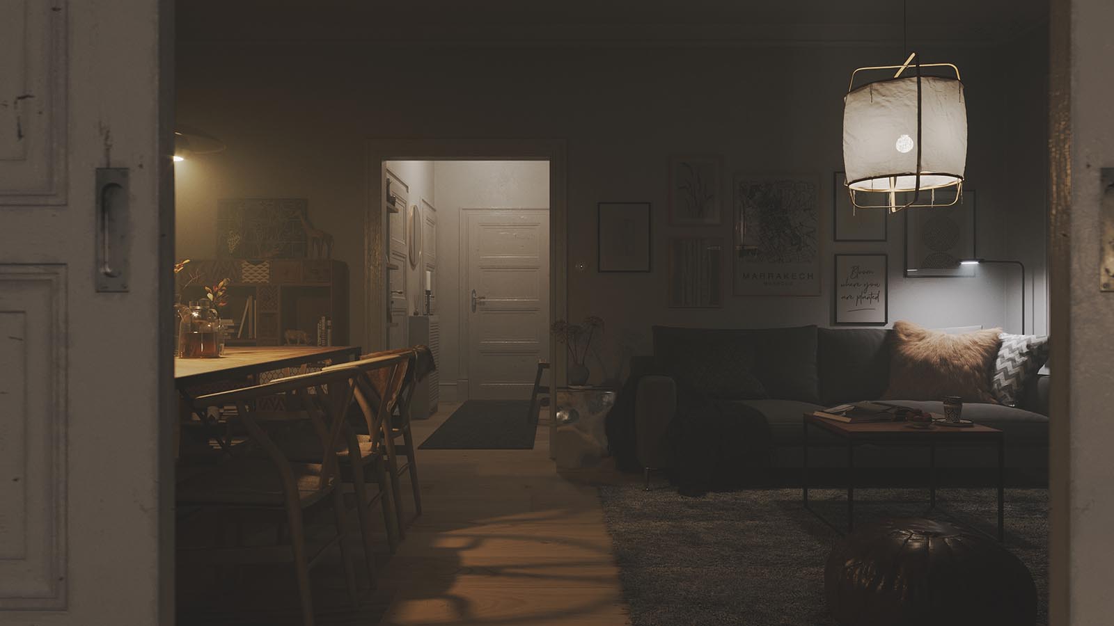
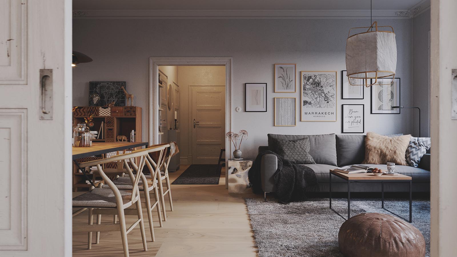
To make nighttime rendering enjoyable, we need to capture the echo of living humans, which is the fancy way of saying artificial lighting. So it’s not enough to underexpose the image and shift the color balance below 3500K. It is not enough to set the hdri map and be satisfied with the results. In fact, here is when the job and the fun part begins. You’ll need to establish a scene dominated by shadows first and break it using additional lighting secondly. Just check the example below:


Once you have established a solid base (not too bright nor saturated), you’ll start to build visual interest. You will stage your lighting to focus attention and create emotions, just like in the theater. So, to help you achieve that goal, there are some tricks that we’re going to share with you. So let’s go through them one by one:
Part 1/4 Base Lighting
Provide low-key lighting
Just after the sun sets behind the horizon, we can still see its light in the visible portion of the sky. As the twilight proceeds, the brightness diminishes until there is only light of celestial bodies left. This transition is often called the blue hour and usually represents the most visually attractive timeframe. To recreate these conditions, we used hdri as an illumination system:

Base Lighting
Hdri Lighting

HDRI map
PG 1958
This serves as our base lighting, and it is the first step to expanding our tonal ranges. We can observe the black masses of shadow that sit on one end of the tonal range and the bright sky on the other. Having additional reflective surfaces in your scene (e.g., glass or water) may get an even nicer interplay of dark and bright areas, but it isn’t the case in our example. Now, as you can see, the light from our hdri is not enough to light the scene. We need to resolve it somehow, and there are two good ways of doing so. Either by increasing the intensity of our hdri (case #1) or by putting additional lighting (case #2).

Increased Exposure
Case #1

Additional Lighting
Case #2
In case #1, we increased the hdri “exposure,” which brightens the image uniformly while keeping the visible sky the same. The other way is to strategically place invisible lights for a better attention focus (check the map below the image for their placement). This way, you can bring up the exposure selectively as well as preserve your deep shadows.
Part 2/4 Interior lighting
Set up the main subject
Now, we’re starting to build the visual interest that we mentioned before. And in this step, we are going to focus on what’s happening inside only. Firstly, you need to ask yourself, “How much the interior should pop up?” And once you decide, use one of the most popular ways that we listed down below (just click and swipe):

You might choose to leave some part of the interiors in the shadows, creating appealing light gradients (case #1). That is easily done with the existing IES lighting scheme. It doesn’t create that much illumination so that we can accent the outline more. You can also use additional lighting in the form of invisible spheres to light the interiors uniformly (case #2). It is supposed to simulate the long-exposure effect when the camera captures a lot of bounced light. Your interiors will become more significant in the overall composition, and it is a good option when they don’t take too much space within your frame. The last example (case #3) shows the interplay between the interior lighting and the reflections. It tends to be visually pleasing, and it can easily become the central theme of your nighttime renderings. So after you decide about the interior lighting, it’s time to step outside and figure out the architectural and landscape lighting.
Part 3/4 Architectural lighting
Highlight the main structural elements
Nighttime renderings are a perfect opportunity to show the materials in a different light. Literally. Stone, glass, plaster, which usually feel flat during the daytime, now live up and exhibit their properties. We can increase the space readability by introducing contrasts of rhythms and bringing that theatrical, powerful element to the image. There are many ways to light up your architecture, but we’ll focus on three popular cases.

Linear, uniform lighting close to the facade increases material readability with all its micro features (case #1). We can highlight the structure of plaster or stone and explain the architecture better. Using spotlights (case #2) introduces different rhythms while enriching materials at the same time. That helps to create a more intricate composition and get the attention focus to a certain point. If you wish to make the image even more striking, you can always use scones for that very purpose (case #3). Keep in mind that the last two examples are visually intense and work best in relatively simple scenes.
Part 4/4 Landscape Lighting
Create the tonal gradation
In the final step, we want to glue everything together in terms of lighting and composition. We want to achieve an understandable depth and focus the attention point even further. Furthermore, we can add a touch of luxury, coziness, or even intimacy to the environment. So again, there are few tricks you can use, which we listed below:

You can establish lighting points that don’t light up the features of your scene much, just like in case #1 or case #2. They just appear as minimal spots of light, but this way, we can improve the readability of the space and introduce some rhythm to it. It also helps to evoke an alluring atmosphere. If we use directional light instead, we can add even stronger rhythms to the scene (case #3). Or break them and light up the landscape very selectively (case #4), focusing on rim lights and silhouettes readability. Remember that you can always add some feature lighting (case #5, case #6) whenever you feel you are left with some dark spots. It often adds that extra spice to your image.
That’s pretty much it! Now, do you remember when we mentioned the different school of thought? Hopefully, yes, because it’s nothing other than breaking the image into smaller parts and deciding how to put them together. So let’s see how it works in the next section.
Examples
It’s time to see which creative decisions we’ve made on each step. How much of the interior should we bring forward? Do we want to introduce regular rhythms or not? What kind of emotions did we build using the landscape lighting? Let’s see what we eventually landed on. Just click and swipe to see the final result:

Light Progression
CommonPoint - Spa
You can make different decisions for the base, interior, architectural, and landscape lighting and make them strategically. Sometimes there will be intense interior lighting, and other times you will do just the opposite. That’s your creative freedom. Every case will be different, and it’s a matter of practice to master the art of nighttime rendering. Still, we prepared some additional examples that explain the big idea behind the image. Before reading the description, try to figure out which type of lighting (Base / Interior / Architectural / Landscape) plays the most significant role.

Northern Wisps
This image is entirely about showing the interior light that’s visible through the translucent fabric. Furthermore, the light is captured by water reflections, but it’s pretty much it. HDRI is set to be very weak. In this example, there is no architectural nor landscape lighting whatsoever, but it works perfectly. Less is more. One more thing, though, simple compositions allow for more dramatic backdrop integration, and this image features it very well.
Hoodoo House
The landscape lighting plays a crucial role in this tent rocks scene. Firstly, regular pool illumination brings the rhythm, establishes depth, and builds an attention point. Secondly, the lights cast from various nooks provide visual hints about how the building and nature penetrate one another. We can also notice a fully illuminated interior space because that grounds the visual interest at the center of the piece.
Henge Hill House
Surprisingly enough, this image is built upon base lighting mostly. The diffused blue hour hdri lighting is all it takes to bring that scene to life. The reason for that is a composition rich in shape and color contrasts. Subtle interior and landscape lights cast are a minor touch that makes space more habitable and luxurious.Artur: “Breaking down any nighttime image into four parts lets you understand the bigger picture real fast. Being equipped with that concept, you're able to pick the minds of any artists you like. Just examine their work, notice what they chose, and reflect on why they did so.”
By now, we understand how to approach nighttime rendering on two different levels. Firstly we set up our base, which has some limitations regarding colors - low saturation, exposure, and tonal range. Then we apply artificial lighting and slowly bring visual interest. There are no boundaries here; we can add color, saturation and expand the tonal range. In fact, we need to. The trick is to use it wisely, so we can focus attention and bring emotions. Now, as you’ve probably already noticed, we were playing only with cold and warm tones, but there’s one more twist to it.
Colors of the Night (Artistic)
There are many ways to convey nighttime art in terms of color, so we encourage you to have some fun with it! Of course, you can always use the desaturated cold tones for the base and break it with warm lighting. Especially when you approach it for the first time. But as you get more comfortable with artificial lighting, play around with color as well. Keep in mind that it’s easier to control the whole image when you separate the “base” colors from “extension” colors. Just be playful and get inspired by all the gorgeous palettes in the examples below:


Blue-greens, blue-violets, and deep blues work very well for the deep shadows. Highlights come to life even with desaturated yellows or the rich reds. There’s no wrong answer as long as you build palettes that contrast each other. We encourage you to observe how other people create unique palettes and to ask yourself: “What kind of colors do they use to break the deepest shadows?”.
Bartek: “The night, with its softness, obscurity and suggestibility, have always felt to me like a great platform to transcend the gap between that CG and painterly feeling. We didn't cover it here but adding volumetrics will boost those aspects even more. Feel free to try it out each time you begin to set up your base lighting.”
And that’s pretty much it, or wait. One last trivia!
Why the Night Seems Below 3500K?
As a part of dark adaptation at low illumination levels, we experience a shift in color toward blue. Even though, in the darkness, we can barely recognize the color. So why does the image on the left look distinctly like a night photograph, and the other one look dull?

Bartosz Domiczek - Scorn of Men

Bartosz Domiczek - Scorn of Men
The brain is playing little tricks on us. How? It starts in our eyes. The retina consists of two types of receptors - cones and rods. They are sensitive elements that absorb light and process the visual signal to the brain. Under high illumination conditions, we use cones, which “recognize” the colors with great detail. But in very low illumination conditions, we shift from cone-based vision to use our rods instead. As a result, we lose the perception of color, but there’s a catch. Rods have a peak sensitivity at 507nm, which is a blue-green wavelength. So when they “work” extensively, our brain uses that information to amplify what we experience as color. Quite fascinating, isn’t it? Now that you’re aware of this phenomenon, you’ll master choosing a white balance that makes your vision of the night perfect.
Conclusion
Nighttime art is an excellent subject to show your taste, understanding of lighting, and way of thinking. If you wish to grow as an artist, just approach it anytime there’s a chance. More so, whenever you see a striking daytime rendering, do a small exercise. Figure out the perfect idea for turning it into a spectacular nighttime image. Put the four lighting parts together and try to visualize if it works. It’s pure joy, but most importantly, it will prepare you for any challenge yet to come.
Enjoyed this article?
Check CommonPoint MasterclassAnnotations / Links
List of useful links:
Purkinje EffectColor Grading Tutorial - Creating a Day for Night Look
5 Reasons Day for Night Footage Doesn't Look Right
Shooting Processing Day for Night Footage
Adaptation of the Eye
In Depth Working with Night Time Scenes
How to Choose the Right White Balance for Night Skies
www.unsplash.com
Stay Tuned!
Enjoy the upcoming free content, all of the updates on our work and other cool stuff we’re preparing for you.
Leave us your email and always be the first to get noticed.